CourseConnect
Exploring how students navigate course selection through a centralized platform

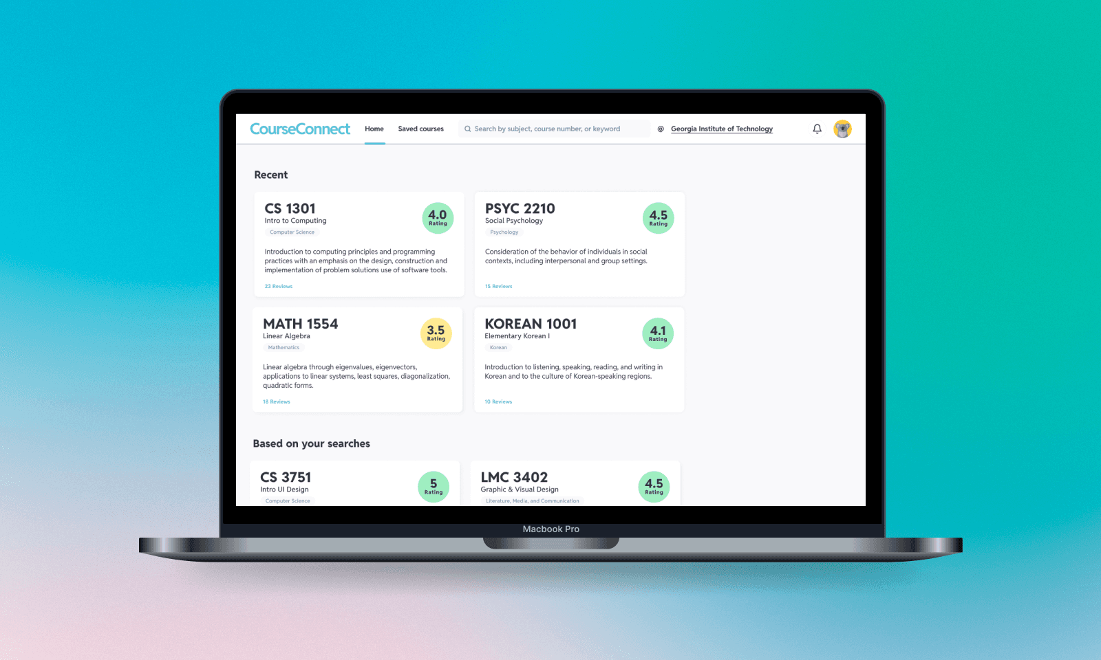
Intro
As a part of a 10-week UX/UI design bootcamp with Bits of Good—a Georgia Tech computer science organization focused on building digital products for local Atlanta non-profits, my partner and I decided to focus on an aspect that all Georgia Tech students share regardless of year or major—registering for courses.
How can design improve student experiences?
Navigating academic courses and making informed decisions can be overwhelming for students due to limited course information. Students often struggle to access accurate information about classes and find peers for guidance, leading to frustration and inefficiencies in their academic journey.
Our solution: Simplifying course selection
A centralized course information hub and peer discussion board to streamline the process of finding class details and connecting with fellow students
Research Goals
01
Identify key challenges students face in making informed course decisions
Understand pain points related to course selection, including lack of detailed, updated information, fragmented resources, and unhelpful advising.
02
Explore how students gather course information and peer feedback
Investigate the tools, platforms, and social networks students rely on, and the role of peer insights in course selection and decision-making.
03
Analyze the impact of inefficient systems on academic planning
Examine how the absence of centralized, relevant resources affects students' ability to plan their academic journey and choose courses effectively.
We asked ourselves, "How might we help students make informed course decisions by providing accurate information and peer feedback in one place?"
Analysis
To gain a deeper understanding of user needs and pain points, we conducted a survey with a pool of around 30 participants from various universities across Georgia. Additionally, we conducted five in-depth interviews to explore user experiences more thoroughly.
We synthesized data from interviews and surveys into an affinity map, allowing us to identify pain points, patterns, and opportunities for improvement.

Findings
From the data gathered in our research, we identified three main pain points:
01
Information Gaps
Outdated syllabi and vague course descriptions make it difficult to find reliable and accurate course details.
02
Inefficient Process
The course selection process is tedious, confusing, and fragmented across multiple forums.
03
Lack of Communication
No dedicated space for discussion and lack of confidence in advisors hinder decision-making.
User Personas
We developed two student personas that reflected key user pain points identified during our research. These personas helped us better understand and address the specific needs of our users in the design process.

Mia
2nd year
Design
Transfer student
Mia is a 2nd year design major. As a transfer student registering for courses, she struggles with vague course descriptions and limited connections, leaving her overwhelmed by the lack of reliable information and peer advice.

Jordan
3rd year
Computer Science
Traditional student
Jordan is a 3rd year computer science major. He spends hours navigating various forums for limited information on higher-level courses. He feels uncertain about his course load and is frustrated by the inefficiency of the process.
User Flow
We mapped a user flow linking the course catalog and discussion board for streamlined access and discussion.

Low-fidelity
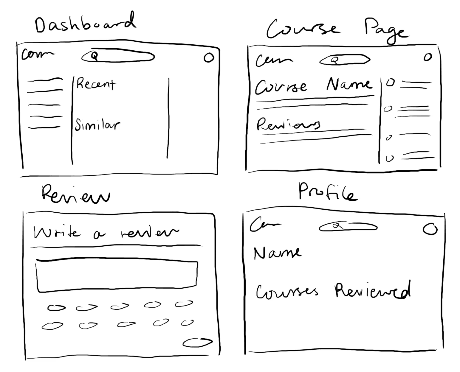
Based on our research, user personas, and user flow, we started developing a foundational framework to support key functions, including a review section and a discussion board.


Mid-fidelity
In our mid-fidelity wireframes, we focused on structuring the information architecture, determining the placement of important elements like syllabi and professor details.


Final Design
The final design is clear and easy to navigate, making it simple for users to access syllabi, professor details, reviews, and discussions. It focuses on usability and organization to create a smooth experience.


Thoughts + Reflection
This project was my first real UX/UI project built from the ground up with a partner, making it a valuable learning experience in collaboration and design thinking. From being able to continue growing my skillset as a designer to learning what works best in a team setting, I felt that I was able to grow in a holistic manner.
Looking back, if I had more time, I would have focused on conducting additional user research to support more iterative design improvements. Gathering more feedback at different stages could have helped refine the experience even further. Additionally, I would love to explore designing a mobile version to ensure usability across different devices. Overall, this project was a great foundation, and I’m excited to keep building on what I’ve learned on future projects.